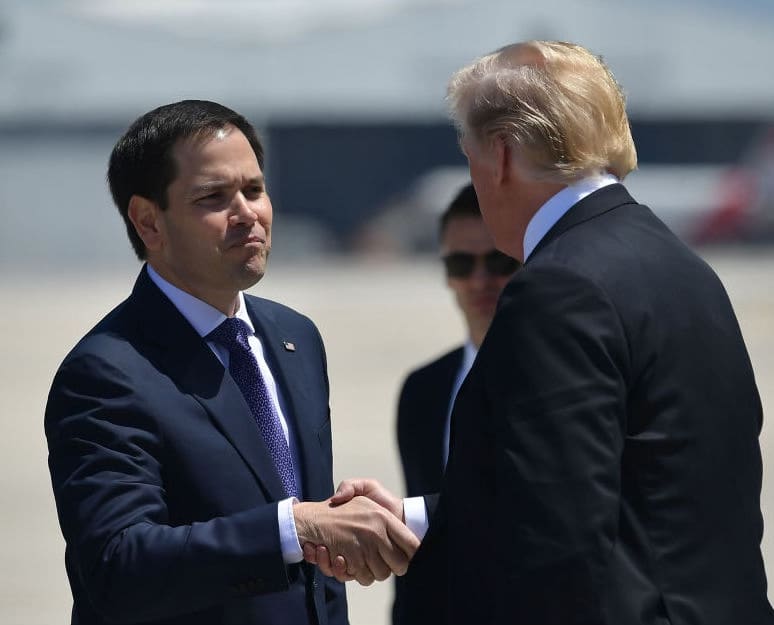
Trump Screens VP Candidates for any Worrisome Signs of Self-esteem
PALM BEACH (The Borowitz Report)—Now in the final stages of choosing a running mate, Donald J. Trump is screening potential picks for any troubling signs of self-esteem, a campaign staffer confirmed on Tuesday.
Now on sale - my only 2024 show!
Tickets are selling fast for my only show this year, October 26 in Princeton, NJ. Grab your tickets here before they’re all gone!The Man Behind the TBR Brand
When I decided to relaunch The Borowitz Report on Substack, I wanted the design of the site to be fantastic. So I was super-lucky to work with a world-class designer, Britt Cobb. Here’s a brief Q&A with Britt—enjoy!How did you approach the assignment of creating a new brand identity for The Borowitz Report, and designing the TBR Substack site? Some designers love starting from scratch. I, on the other hand, need a little more material to get the juices flowing. Fortunately, The Borowitz Report has been around a couple decades in various forms so I could pull from that history for inspiration. As for this particular version of TBR, it's returning to its original form: a simple newsletter arriving in your inbox every few days, sent directly to you by the author himself. So pure and unencumbered! So, something about the brand identity had to feel simple, direct, and no fuss. This also marks a new chapter for TBR, and it needed that "behold! I have returned!" kind of confidence. The Borowitz Report has been around since 2001, but no one ever called it TBR until you designed the TBR logo. Now it seems like everyone is calling it that. What was your concept behind the logo, and does it make you feel powerful knowing how much influence you’ve had over other people’s behavior? My evil acronym plan worked! While I wish I had that much power over human behavior, I think people just favor brevity. They saw the TBR shortcut and were excused from typing 15 extra letters. But I do love how graphic design is an interactive thing that requires people to engage with what you've created, and sometimes you really can affect how someone feels or acts about something. Hopefully for good. As for the concept behind the logo, I really liked the tagline "Home of Truth." It sounded like the perfect decoy for a satirical newsletter. The idea that on the surface TBR presents itself as honest, upstanding news journalism and then very quickly, the cracks start to show. Like, before you even finish the headline, you're hit with the punchline. So, the logo is meant to look like official business. A trusted journalist clacking away at their typewriter. It's a serious, but very thin veneer
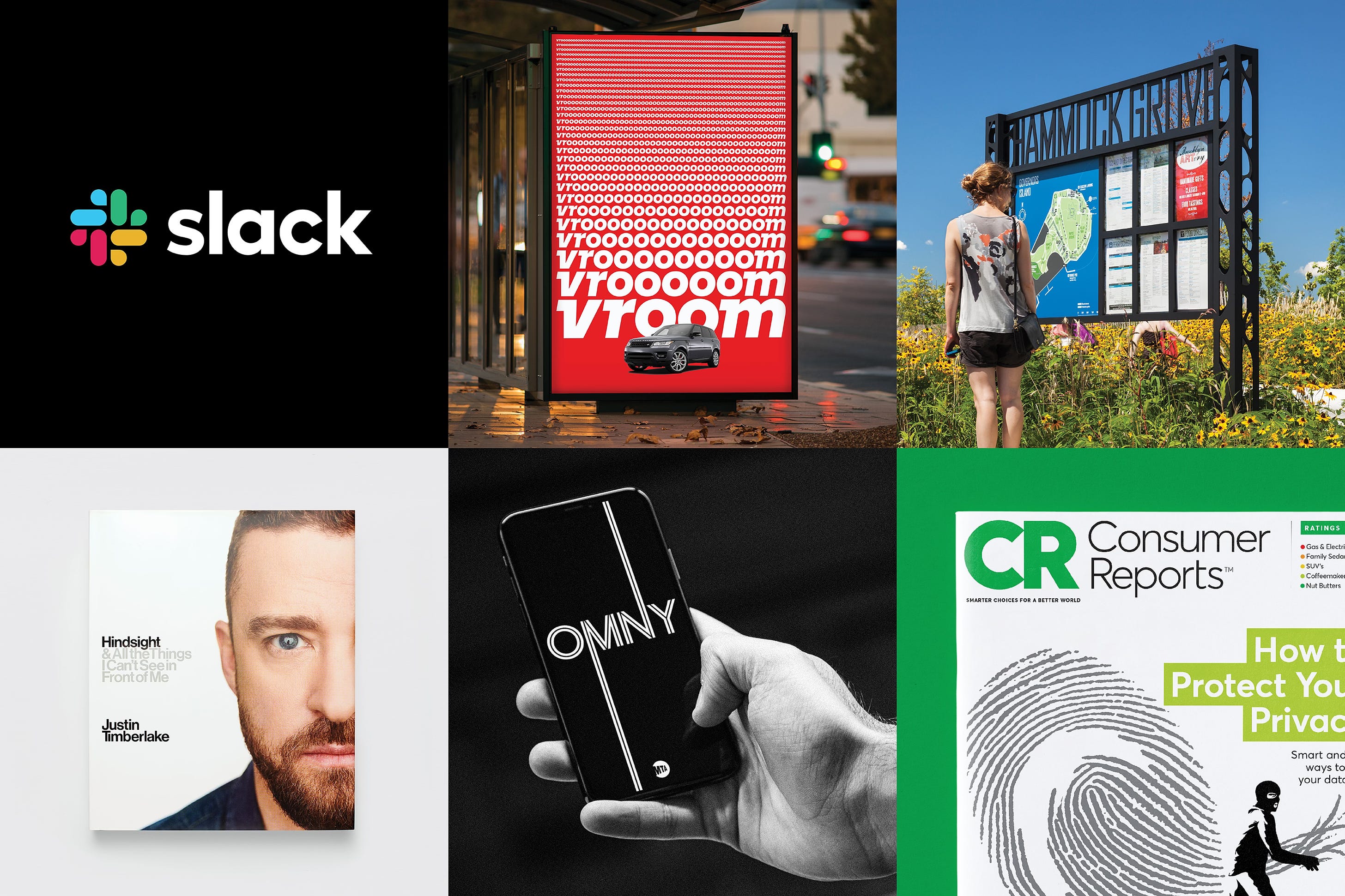
.You’ve just launched your own design company, Cobbco Design. What are your dreams/ambitions for this enterprise? I've had the good fortune of working for 15 years at Pentagram, the best design studio in the world (you can fact check me on that!), and the ride has been pretty incredible. I've designed logos for companies like Slack, a book for Justin Timberlake, graphics for the Obama Presidential Center, and so much more. All along, I knew I wanted to build a similar studio that had variety baked into it, working with clients that want to make their mark on the world too. As for the next project I want to chase down, if anyone knows someone at Jeopardy, please put me in touch. I’m a fan of the show and I desperately want to get my hands on that logo and on-screen graphics!
|


Commentaires
Enregistrer un commentaire
Thank you to leave a comment on my site